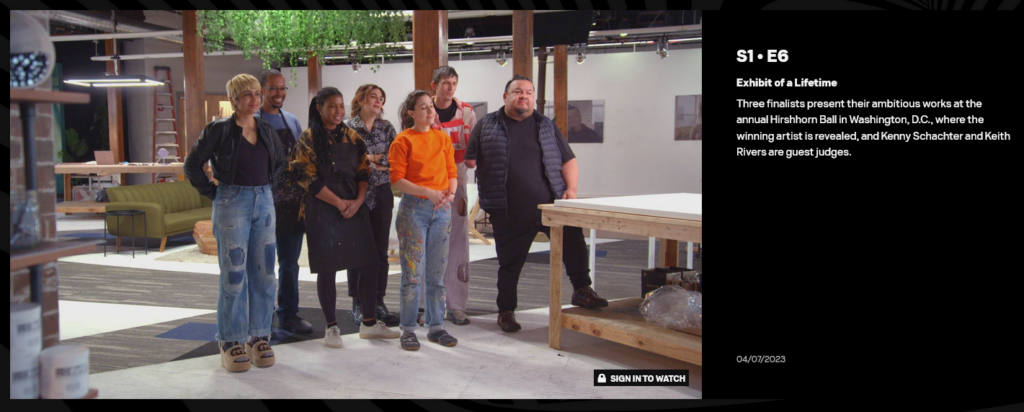
I learned about Jillian Mayer from the first season of the new MTV show: ‘The Exhibit: Finding The Next Great Artist’, where 7 artists respond to prompts and make artworks in a limited amount of time. It was a good show that managed to find a voice that balanced accessibility and art-speak.

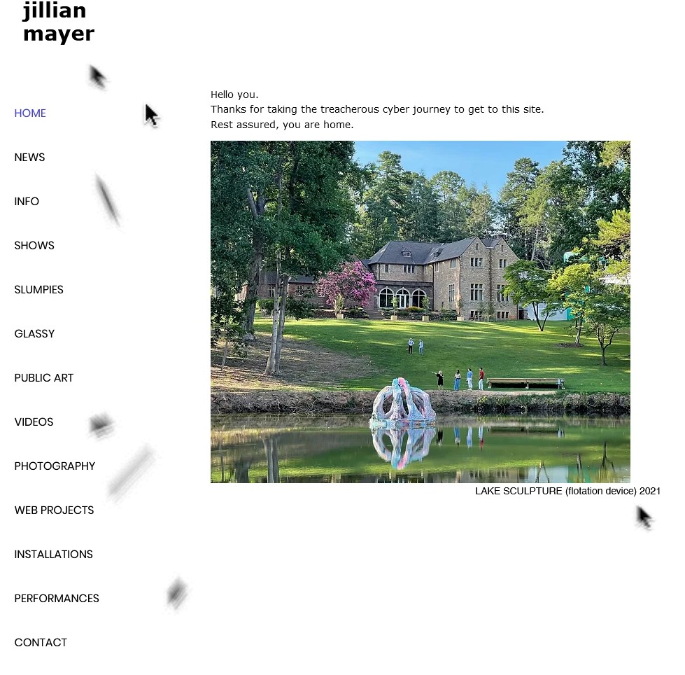
I will probably write more about the show in a later blog post because I have a lot to say about it, but right now I am just going to discuss Jillian’s website. I have been researching the artist website/ digital portfolio format for a couple months now. So many artists have the same SquareSpace ready-made portfolio websites with the same fonts and same galleries – and it works – but it has become so dull as it becomes more and more common. Jillian’s website is a great example of how the medium (of artist’s website) is an opportunity to present your work in a way that compliments the artist’s style/ personal aesthetic. Jillian’s site is humorous, clever, and very clean + well presented. You are immediately confronted by an animation where the a mouse cursor begins to multiply and swarm inside the browser window as well as message of reassurance that you are in the right place, nothing is wrong, and prepare for things to get weird.

Leave a Reply